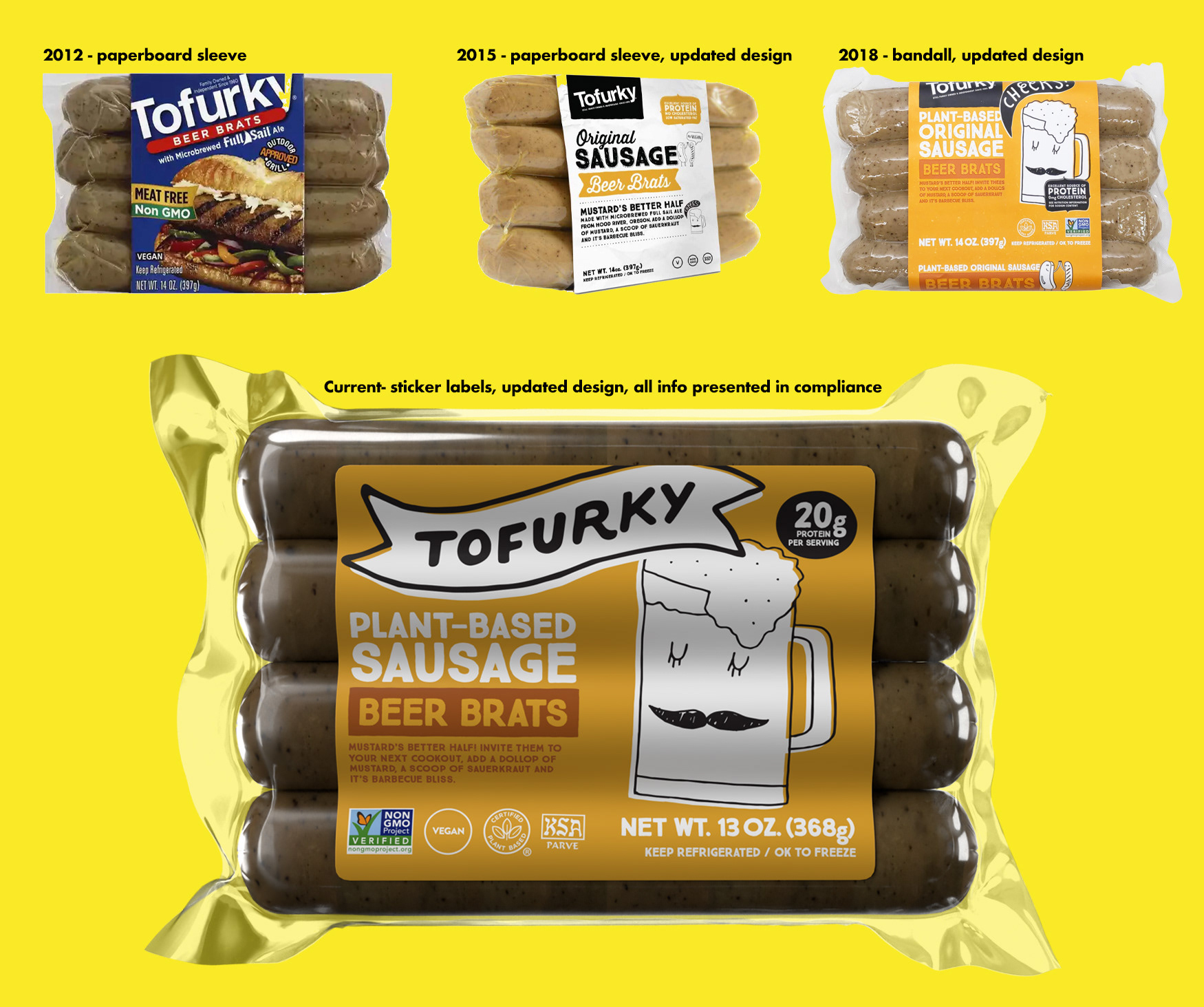
After the monumental effort of creating a fresh, new brand for Tofurky to re-enter the market, the real challenge began: rolling that brand out to all packaging. With over 40 SKUs in the U.S. and 50+ worldwide, it was months of focused design work to bring the updated look to life.
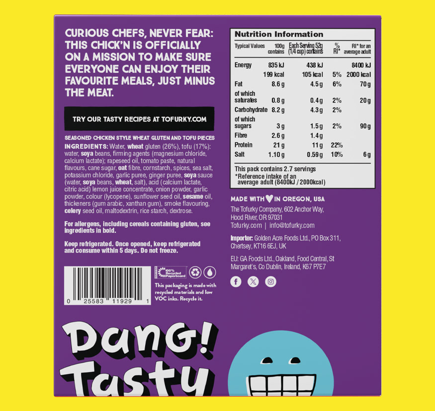
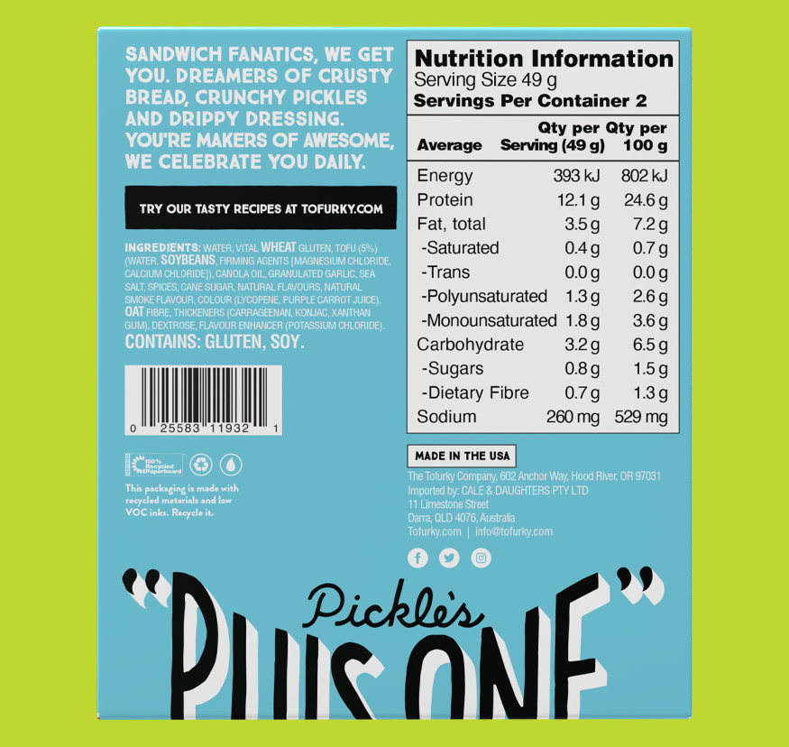
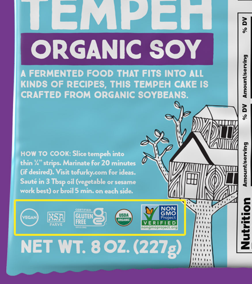
As a vegan product, Tofurky attracts a discerning audience—customers who care deeply about the quality of their food and what goes into it. To meet their expectations, I not only maintained consistent, brand forward designs but also ensured every detail was spot on. This included managing accurate nutrition information, tailoring it to each product, and overseeing multiple certifications from various certifying bodies. Every aspect required meticulous attention, from ingredient lists to ensuring compliance with branding standards for certification marks.
Additionally, I streamlined die lines and optimized file weights to simplify production processes and ensure efficient delivery to printing partners. These improvements not only reduced complexity but also contributed to a smoother workflow, maintaining the high standards Tofurky's audience expects. All in an effort to deliver transparency, quality, and a package that spoke to Tofurky’s values.
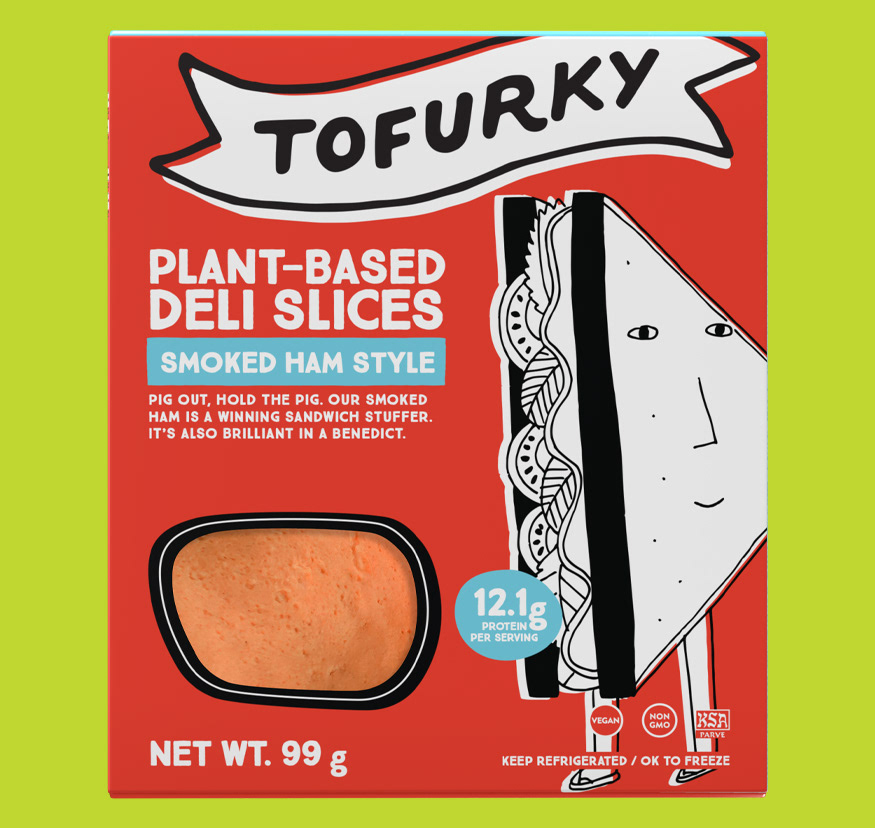
Here’s a glimpse at the packaging evolution I had the privilege of shaping. It started with refining the essential and legal elements—correcting their presentation and placement—and then using the rest of the package to push the branding farther. I worked to give Tofurky a stronger, more commanding presence on its packaging, ensuring it stood out boldly and confidently on shelves and with the use of customer testing and heat-mapping technology.
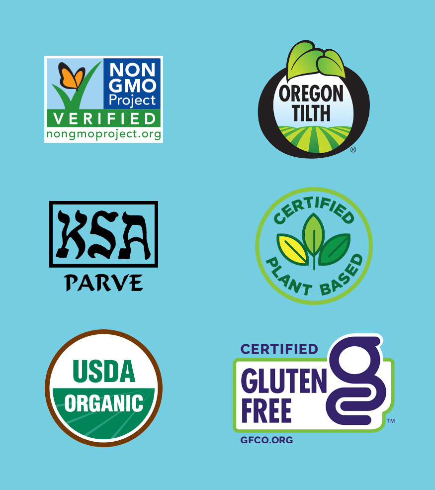
Below are some of the US certifying marks that I am most familiar with. Each has specifications as to how it can be used, where it can be used, when it can be used and so on. While working to bring the new face to all of Tofurky's package's it was crucial these marks were perfectly represented ensuring the customer would be able to easily identify important information at the shelf. Getting them right also guaranteed that Tofurky packages were in compliance as to avoid product from being held and not able to sell, product pulled from shelf and potentially expensive reprints.
Tofurky has product available for sale all over the world, literally at one point in every single continent. Foreign markets come with hosts of ultra specific compliance, guidelines, information and things like language barriers. Leading the design for all that is Tofurky packaging, this challenge came to me. While striving to make absolutely certain that all legal stipulations were met for each package I still worked very hard to provide the Tofurky brand experience on each package with what space was left.
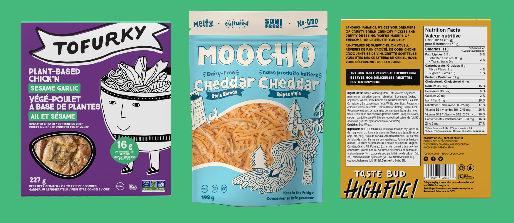
Below are some views from some of the Tofurky International product line. Canada is up first and to be perfectly frank, Canadian packaging is...an enormous challenge. The necessity for US products to present themselves bilingually with no more extra room forces choices. Choices like, what is absolute mandatory and what from the US packages has to fall away. While serving the design for ever Canadian file in double instances it was still important for the Tofurky brand to shine and presently as much of it's care free and fun ethos as it could...even with some massively oppressive restrictions.
These sample images highlight the use of dual language, larger nutrition information panels, larger type size requirements and many things that fly in the face of design. Given those strict orders, the package faces still seem light fun and full of the Tofurky spirit.