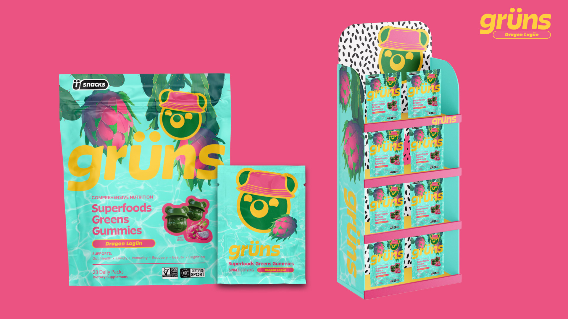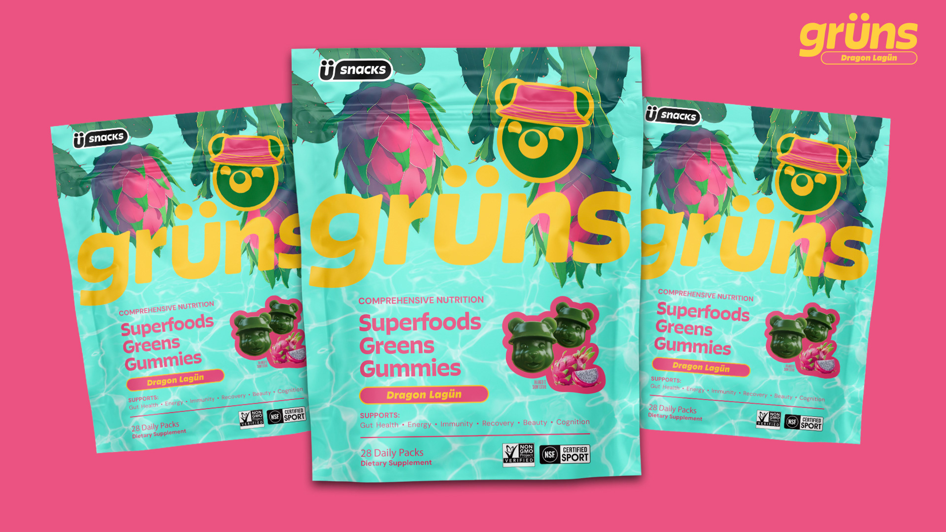
This project was part of an interview process with Grüns, a supplement brand known for its bold packaging and bright, approachable energy. The challenge was to take the provided flavor concept, Dragon Lagün, and bring it to life through packaging, illustration, and retail display design while staying true to the brand’s visual system. I started by researching dragon fruit, its origins, how it grows, and the tropical environments it thrives in. Native to Central America and often found near lagoons, the concept immediately clicked. I built a mood board full of lush texture and color: dragon fruit vines heavy with fruit, the rich greens of Monstera leaves, and the shimmer of bright tropical water.
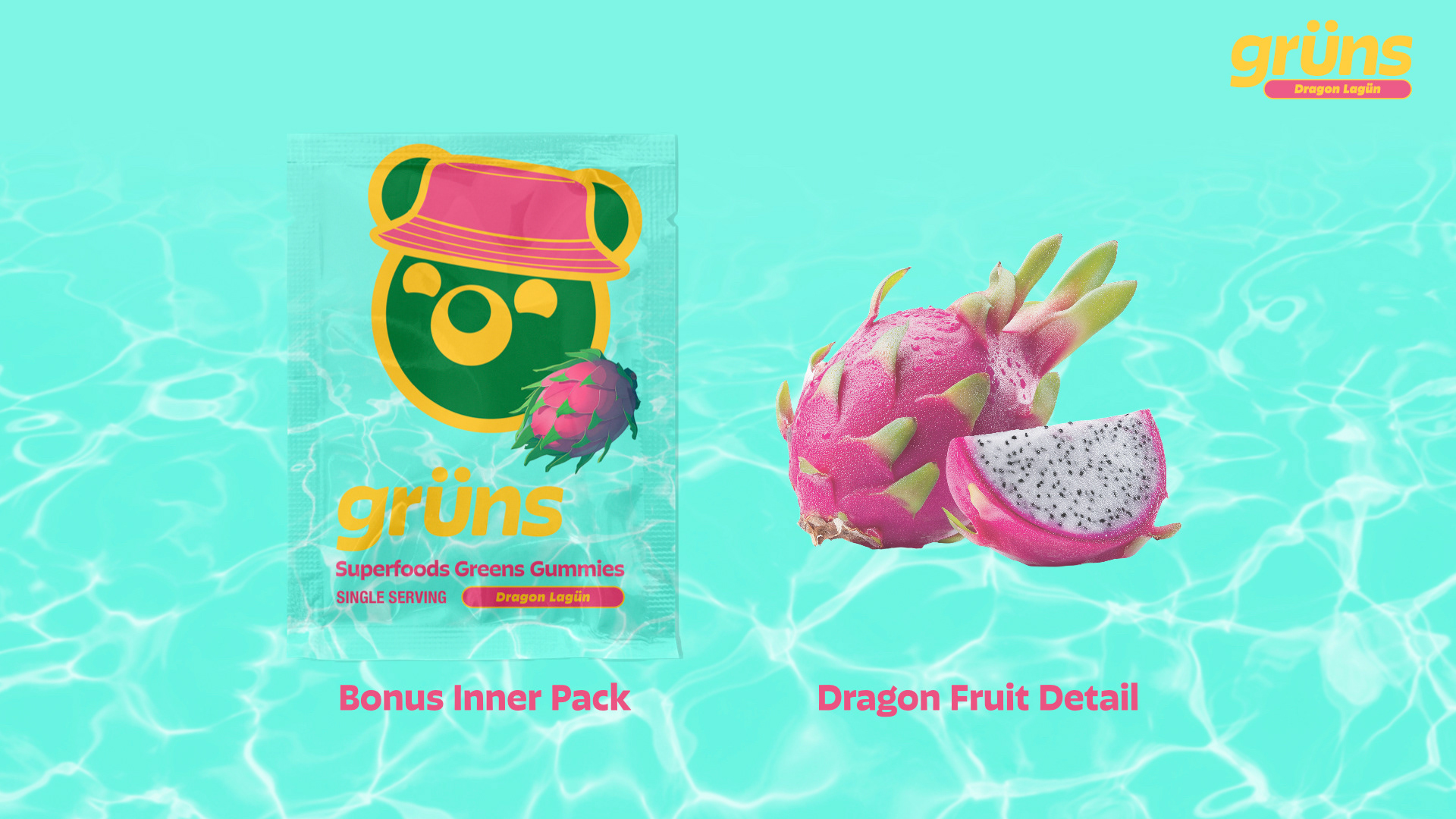
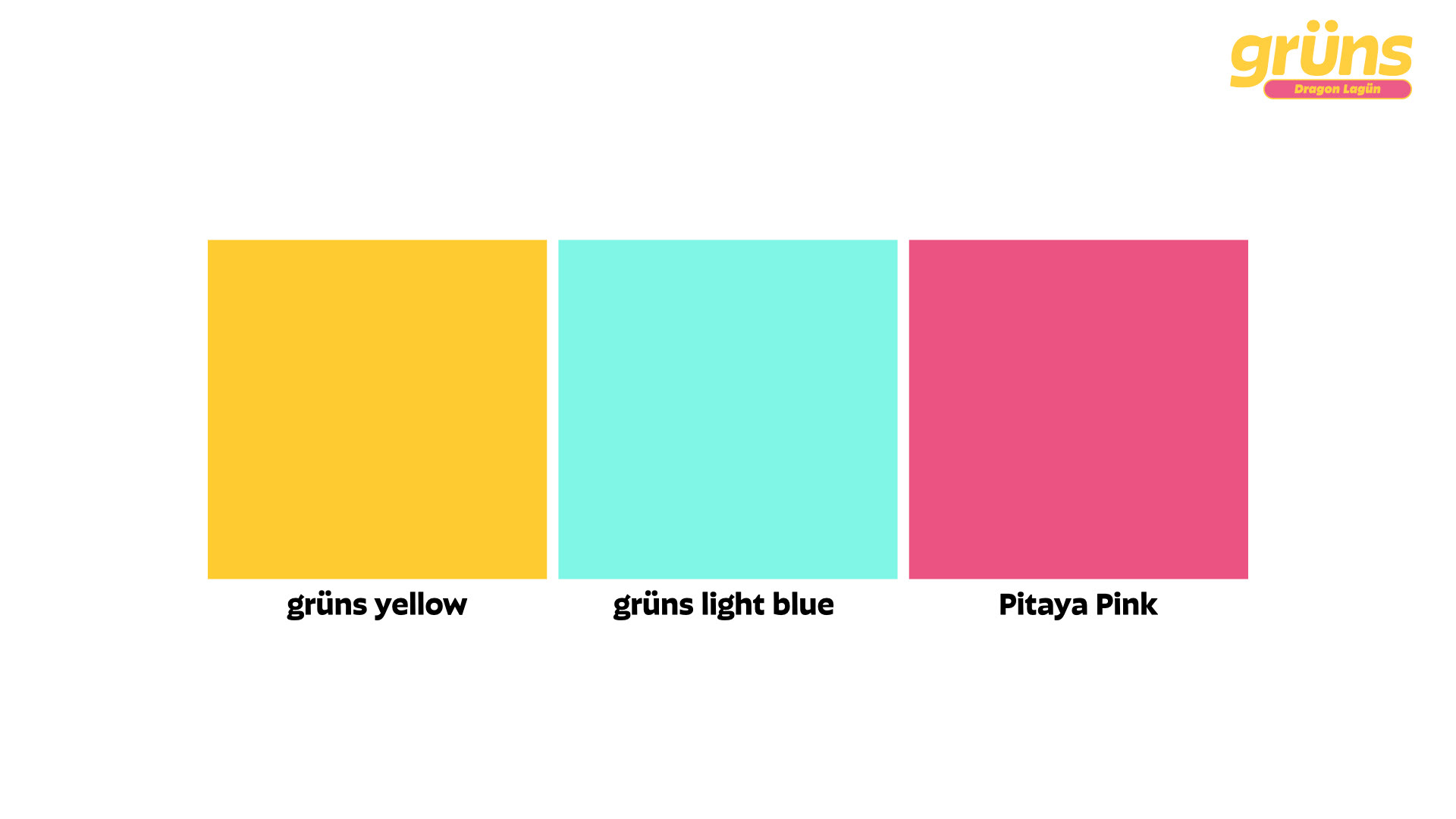
Early concepts leaned too literal, baskets, waves, coastal scenery, but they either felt flat or too busy. After experimenting with illustration, photo manipulation, and digital painting, I landed on a direction that felt alive and on-brand: dragon fruit plants hanging over calm lagoon water, tied together with a subtle shimmer texture for balance and legibility. The final design pairs a custom Pitaya Pink with Grüns’ light blue and canary yellow to evoke sun, water, and tropical freshness while staying true to their established palette.
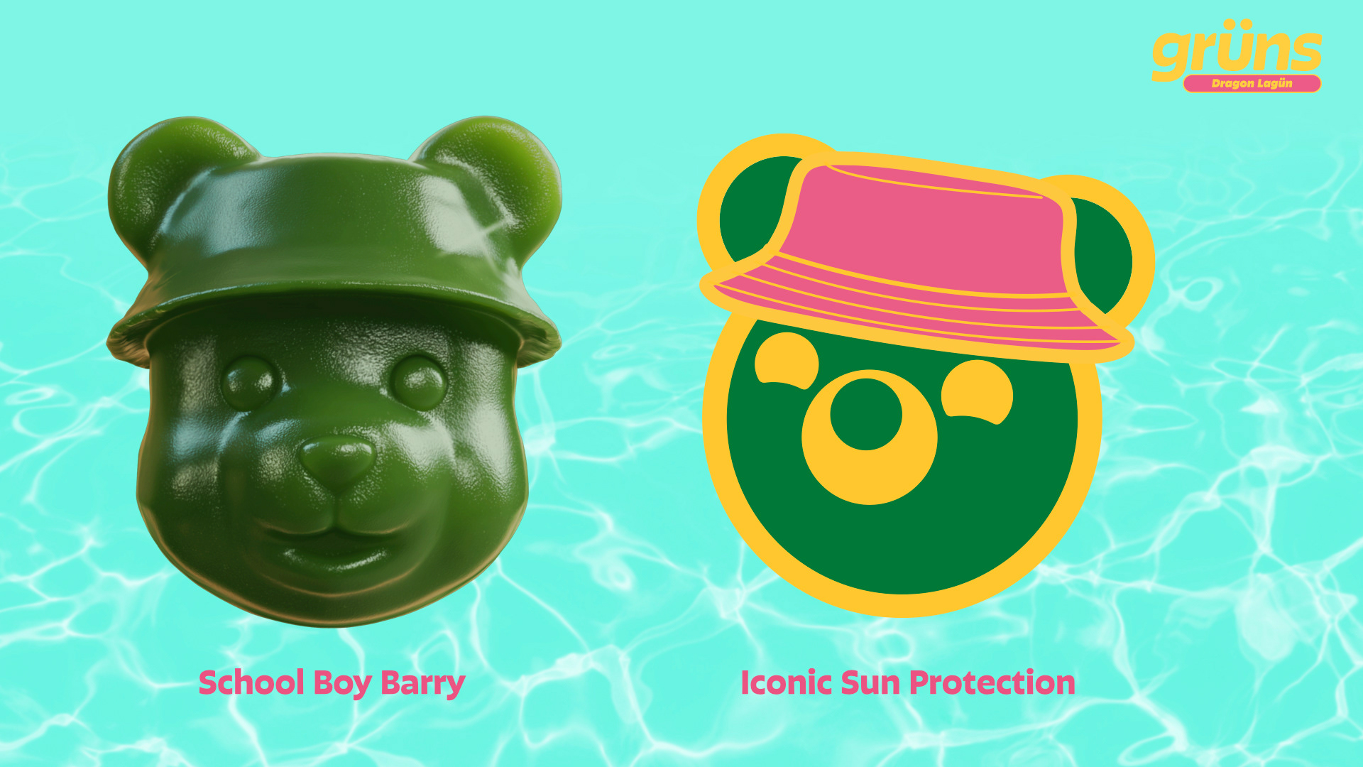
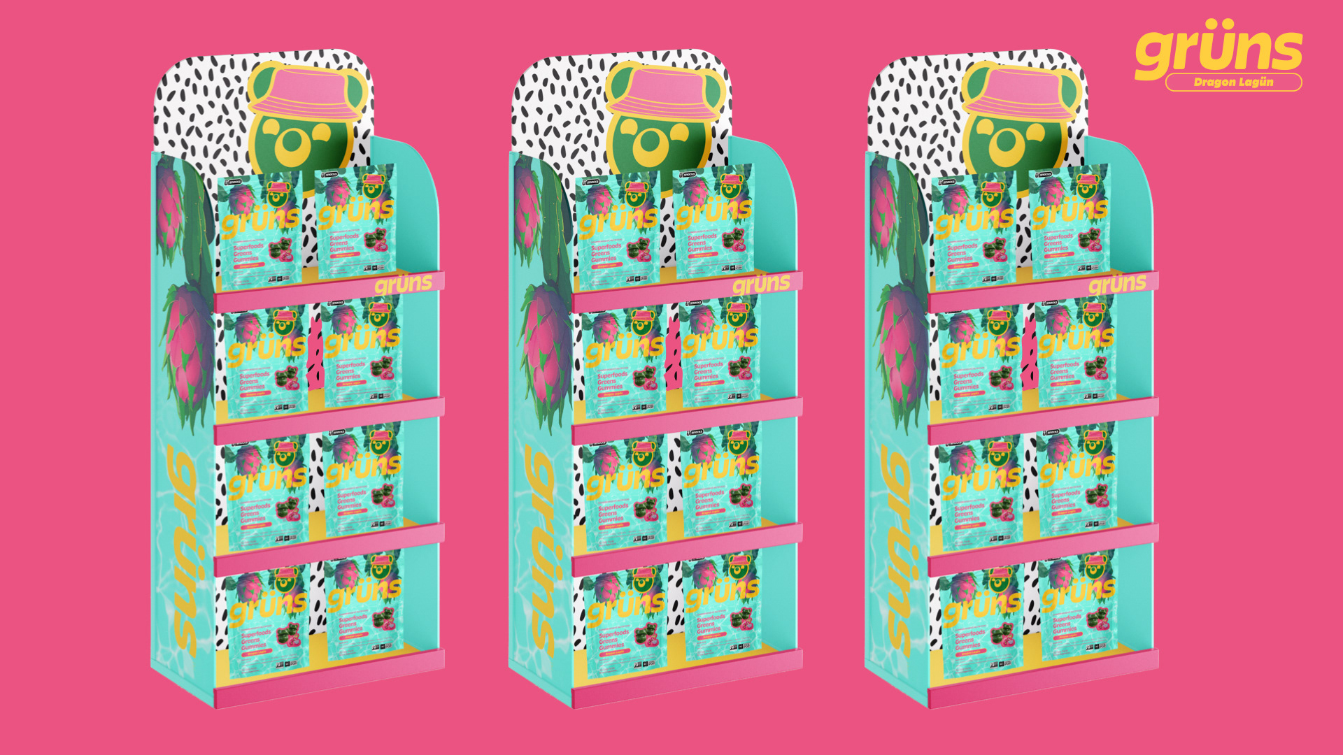
To round out the world of Dragon Lagün, I developed a themed retail display, an inner pouch, and a refreshed look for Barry the Bear, this time wearing a bucket hat to fit the tropical vibe.
Design Notes
• Custom digital illustration and photo compositing
• Original “Pitaya Pink” color development
• 3D render mockups for packaging and retail display
• Expanded mascot concept (Barry the Bear)
• Focused on legibility, storytelling, and brand cohesion
• Custom digital illustration and photo compositing
• Original “Pitaya Pink” color development
• 3D render mockups for packaging and retail display
• Expanded mascot concept (Barry the Bear)
• Focused on legibility, storytelling, and brand cohesion